National HCAHPS Patient Experience Dashboard
- Edgard Ledea
- Nov 19, 2025
- 2 min read
Updated: Nov 20, 2025
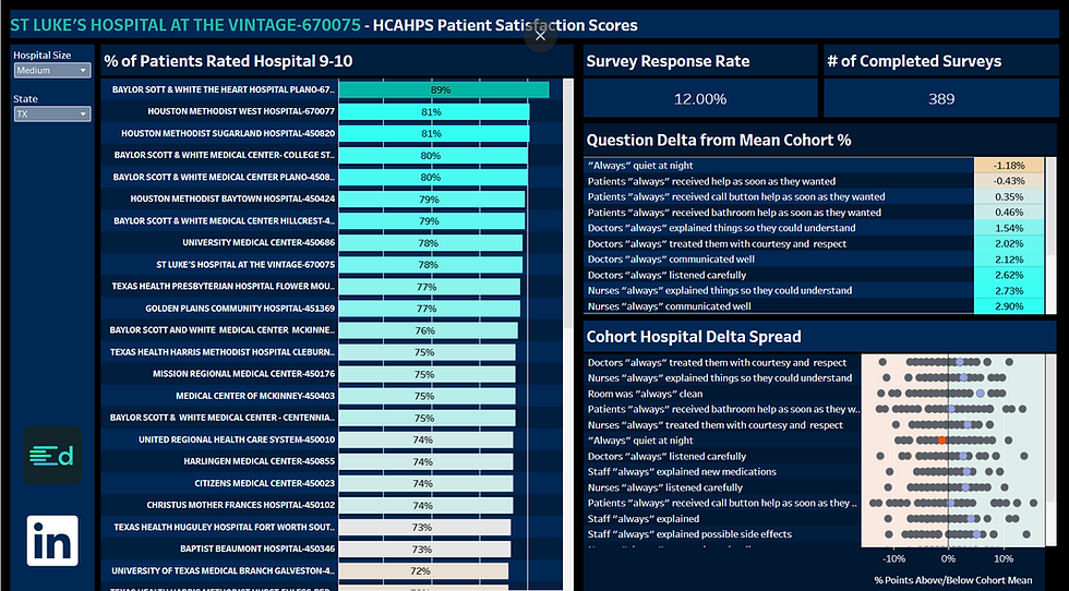
This dashboard analyzes nationwide HCAHPS (Hospital Consumer Assessment of Healthcare Providers & Systems) survey data. Users can view any hospital in the United States, compare its scores against peer facilities, and filter results by State and Hospital Size to customize the comparison group.
I built this tool to help quickly understand how a hospital performs relative to its cohort using clean visuals, custom branding, and interactive drill-downs.

What This Dashboard Lets You Do
Search any hospital in the national HCAHPS dataset
Filter by State to create regional comparisons
Filter by Hospital Size (Small, Medium, Large) for apples-to-apples benchmarking
Drill into:
% of patients rating the hospital a 9–10
Survey response volume
Question-level deltas (patient experience drivers)
Cohort-wide performance spread
Spotlight Example: St. Luke’s Hospital at The Vintage (TX)
For the example shown in the screenshot, St. Luke’s can be compared to similar-sized hospitals in Texas.
High-performing areas:
Room was always clean (+5.78% above cohort mean)
Staff always explained possible side effects (+5.10%)
Nurses always treated them with courtesy and respect (+3.46%)
Opportunities:
Quietness at night (–1.18%)
Call button responsiveness (–0.30% to –0.43%)
Tools Used
Tableau (Calculated Fields, Parameters, Custom Color Palette, LODs, Relationships)
SQL (Ingesting data, Cleaning facility info, Normalizing Addresses, Joining multiple datasets)
Excel (Pre-ingest validation and profiling)
Data Sources
CMS HCAHPS National Survey Dataset
CMS Hospital Characteristics (beds, address, location)
Process Overview
Imported HCAHPS raw files into SQL and standardized facility identifiers
Normalized address fields and merged with hospital characteristics
Built cohort logic & comparison calculations (communication, cleanliness, responsiveness, etc.)
Designed dashboard in Tableau using my custom palette
Added filters for State and Hospital Size so viewers can build their own comparisons
Published the interactive version to Tableau Public for public access


Comments